Client: WhooshMail
Role: UX Designer
Task: Email Platform Redesign
Overview
My task was to design two user flows for an email marketing campaign web app called WhooshMail.
The two flows will include the same screens, but with two different user roles. The first role being the “Admin” role and will have the highest level of access while the second role, “Basic”, will only have access to a few features.
WhooshMail is looking to improve the experience for both of these roles with their audience of small business owners and entrepreneurs.
Pain Points
- The process can be clunky and confusing
- There are a lot of competitors so we need to stay competitive and have similar features
- What features are accessible to each user role can be confusing

Goals
Through improving the experience for our main user roles (admin and basic), we’d like to see an increase in user retention and also the number of campaigns sent. We would like to achieve the following;
- Increase the first month retention by 20%
- Increase daily active users by 10%
- Increase campaigns sent by 20%
User Personas & Storyboards
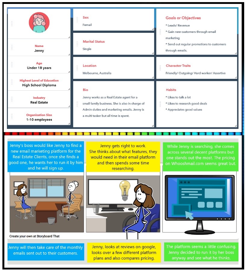
Basic User - Jenny
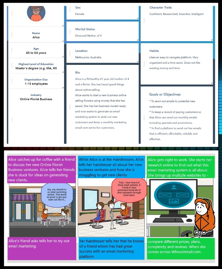
Admin User - Alice
Competitive Analysis
MailChimp
Strengths
- Marketing Tips
- Analytics
- How to Instructions
Weaknesses
- Sign up is everywhere, too much
- Website is busy
Constant Contact
Strengths
- Simple layout
- Help features & page
- Downloadable guides
Weaknesses
- Only 2 pricing plans
- Email templates hard to find
Mailer Lite
Strengths
- Simple layout
- 5 pricing plans
- Guides and tutorials
Weaknesses
- Too much content on the website
Analysis Assumptions
I think users are interested in getting good value for money, competitive prices for their plan based on being a first time user. They haven’t used the platform before so knowing if they are getting good value for money is based on assumption.
I would assume that users would like to see an easy to navigate platform with simple step by step instructions on how to set up campaigns and automation.
I don’t think it’s a good idea to have too much content around the platform as this would easily become confusing and make users feel lost.
Users for this email platform would typically be through word of mouth and advertising, whether it be via ads, google or social media, users would definitely be comparing different platforms for this type of service so it is very important that the platform stay competitive comparably to others offering the same service.
I would assume most users creating a campaign on this platform would be using a desktop/laptop to create their campaign as it is a lot easier than trying to use a mobile or iPad with so many features and attributes to set up. Internet speed would definitely be a major factor, so creating too much content would easily slow the process to an unreasonable level. Keeping the platform simple but effective is a challenge but a really important factor.
Designing a platform that users feel comfortable and can complete a campaign quickly would be beneficial as by looking at current competition, this seems to be a challenge throughout.
Sketches
Basic User
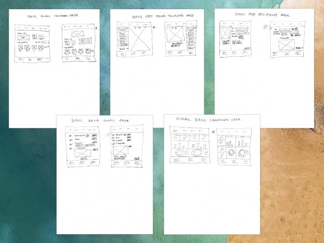
Sketches
Admin User

Sketches Approach
After completing the research on the layouts of the Email Campaigns on different platforms, i tried to replicate an easy to navigate layout.
I tried sketching different simple designs with each of the screens needed with a minimalistic approach and subtle editing tools, including pop-outs in areas of detail and straight forward text descriptions.
I tried different alignment layouts deciding on both left and right for editing and centered for template choosing. I chose a basic layout for the Admin email campaign page with previous campaigns added below the available templates. I tried to add the ‘How to’ section on the basic email campaign at the top center of the page along with a video, description and photos of further steps. The templates for this page were added below so the user would have a clear idea of the steps needed from here before starting the process.
I chose a familiar approach with the editing page with chosen templates in the center and editing tools on the right hand side of the page for the Admin version and the Basic version, i chose to add the editing tools on the left as well as a send section to be reviewed by admin. I also included this feature in the final page for the basic send email page so that the user could send it to admin to be reviewed before the final click to send.
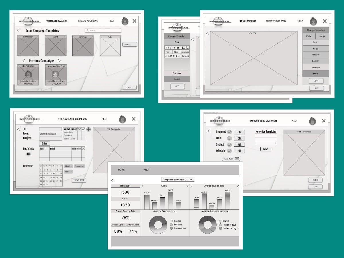
Wireframes
Basic User
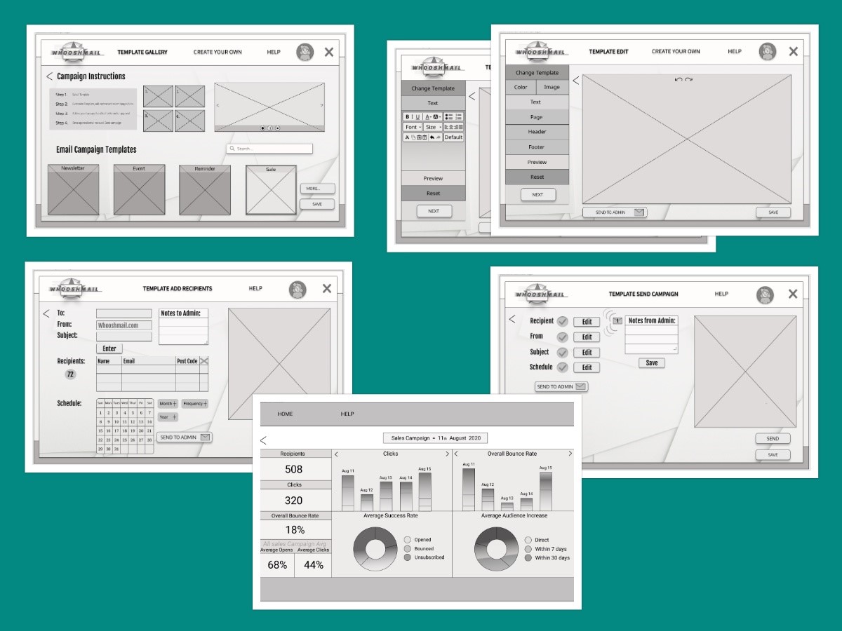
Wireframes
Admin User
Usability Testing
Link to Basic Prototype: https://www.figma.com/proto/C73kJYsZRsprxXLD9WRBbE/BasicEmailCampaignAndAnalytics?node-id=28%3A29&viewport=42%2C468%2C0.08094710111618042&scaling=min-zoom
Link to Admin Prototype: https://www.figma.com/proto/x6XdsDKQ0e8GTYepHImfOv/EmailCampaignAndAnalytics?node-id=1%3A2&viewport=-1271%2C960%2C0.5&scaling=min-zoom
Tasks
How would you create and edit an email marketing template?
How would you send the marketing template, once all required tasks are completed?
How would you find the Analytics page of the email campaign you just sent?
Questions for Participants
Can you tell me if there was anything in particular that you enjoyed through your navigation process?
Did you find anything frustrating at all? If so, why was that if you could please explain?
Do you have any other feedback for me?
Usability Test Analysis - Basic User
What went well?
- Navigation straight forward and easy to use.
- Users understood well the layout and options available.
- Users liked the layout design.
- Participants could find their way to each requested section during the user test.
- Structure makes it quick to perform actions needed to the requested template completion.
What needs to change?
- Button Call to action descriptions need changing.
- Add a pop up for send admin email review feedback.
- ‘Send test’ button needs to be smaller in comparison to the ‘Send’ button and also location changed.
- Button locations need to change within the layout.
- A home page would be a nice feature for this user test
Usability Test Analysis - Admin User
What went well?
- Navigation straight forward and easy to use
- Users understood well the layout and options available
- Users liked the layout design
- Participants could find their way to each requested section during the user test
- Structure makes it quick to perform actions needed to the requested template completion
What needs to change?
- Button Call to action descriptions need changing
- More edit option interactions included in final design
- ‘Send test’ button needs to be smaller in comparison to the ‘Send’ button
- Button locations need to change within the layout
Mockups - Basic User
Mockups - Admin User
Learnings
I learnt some very valuable lessons from this project including how to sufficiently use interactions to cater for all users using color interactions with the hover feature in figma.
I also learnt from the user research that the high fidelity mockups can really take a big facelift compared with the medium fidelity mockups based on the feedback from users.
Placement of items is so important and i had not realised this until this stage in the assignment. Confusion is so easily caused by placing buttons and alike elements in the wrong sections or even not naming the buttons clearly enough that users would understand the functionality.
What i would do differently next time?
I would not do too many things differently next time, except maybe spend more time making sure items are appropriately placed before the user test phase.I would also play around with font styles more in order to get the perfect styles that fit the personality of the brand.
I’d like to also learn how to add some more interactions during the medium fidelity mockup stage to gather a wider feedback from the participants within the user test phase.
Other Case Studies
Shirts By Mike
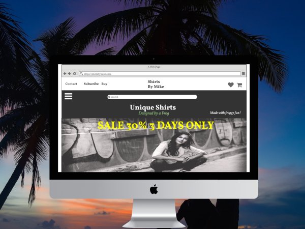
Case Study
T-shirt website; 'Shirts by Mike'. Company objectives included giving the website a fresh new design, Increase sales and launch a featured t-shirt of the month.
Read MoreLowest Lane
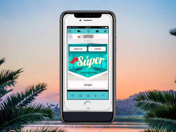
Case Study
Created for WhooshMail, An email Marketing Campaign. Company goals involved Increasing first month retention and campaigns sent by 20% ..
Read More