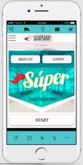
Client: Lowest Lane
Role: UX Designer
Task: Mobile App Design
Overview
The goal of this case study was to produce a prototype of a grocery shopping app which addresses pain points to grocery shoppers and helps to combat these pain points.
Initial research by interviewing participants is conducted in order to get an idea of the majority of pain points that users face.
Approach
In trying to determine an approach to my grocery shopping app, i needed to include conducting interviews with a group of users who will most likely use this app or benefit from the app.
I want to discover the types of customers they are, by asking questions about how their normal days activities would pan out also by asking about their hobbies.
This information will help me better understand their main goals when doing shopping or reasons for shopping at a store or via an app.
In conducting these interviews, i am aiming to discover what their goals are that would benefit from the app and pain points they have from shopping in order to use this information to structure the app to suit their needs.
Target Audience
I aim to find different age brackets in order to cover a wider audience but not specifically.The target audience in my opinion is very broad in age bracket but begins to close when the words ‘tech savvy shopping’ is targeted.
The app will most likely be used by those that already use technology to do shopping or those that like the idea of modern technology and also do the shopping for their household already.
I have decided to filter out candidates by using a short survey first to target my intended audience via social media, then select a group to survey based on the variety of the audience, for example, different age brackets and times they shop per week.
I want to capture as many different answers as possible to filter out the most obvious pain points when shopping and hope to capture shopping pleasers for my next part of the process of my shopping app design.

Link to Survey
https://surveyfrontend38.herokuapp.com/join_course_survey
Affinity Diagram
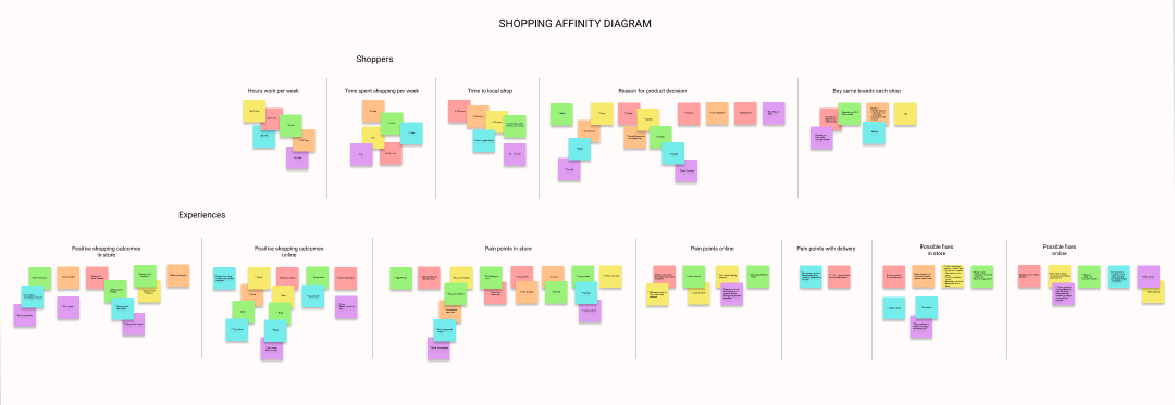
User Research Analysis
After completing the research phase and looking over the affinity diagram. I discovered that participants and potential users to the grocery shopping app found the following issues within their current grocery shopping experiences;
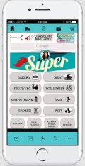
- Finding products is an issue.
- Not only are product sizes of the same product not grouped together in most shopping apps sizing of products against any type of chart is missing.
In bringing the product size variety to the same page, this knocks out two pain points. It will show a difference in product size against one another and also stops the unnecessary scrolling to find the correct size.
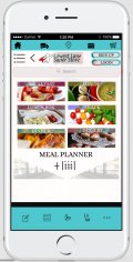
- Meal pairing is also something that a couple of users wished that shopping apps contained.
Being able to find a meal that they want to cook and then have the items for that meal provided within the same page to add to the shopping cart.
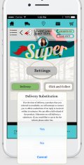
- Delivery substitutes was an issue amongst participants.
Creating a substitute messenger feature within the app prior to delivery to confirm that customers are happy with their substitutes picked out for them before they are delivered.
This could be designed so that there is a snapshot or list of items that were substituted sent to the customer prior to delivery.
Giving the customer a time limit to reply if they are ok with it.
The customer would know ahead of time that this snapshot will be sent if needed, so they are still given the control of what is going to be the delivered end result.
To save that time constraint, if customers decline the substitution, then a full refund of the item could be a good way to finalise a decline result. Giving customers 30 mins to reply with their decision could be an option also.
This would give the customer power over what their final delivered products would be, taking away the pain point and frustration they feel of getting items that were not previously consented to.
Substitution is a nice feature that current grocery apps have, but because Quality is so important to the users, the quality checking and final decision should lay in the hands of the customer.
Solution for Design
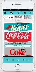
I plan to make the product sizes in one page. For instance, Coca-cola. Instead of finding a 6 pack of Coca-cola, then deciding after finding the product, that i want to buy a 12 pack. I can scroll down the same page to find it. Not have to go back and search through every soft drink product again.
For the meal pairing, i plan to make products available for purchase within the meal recipe page. This would include a calender where users can choose which day of the week they want to have that meal and at the end of the saving meals to the calender. They can print off a meal planner for the week, while also having all of their ingredients conveniently added to the shopping cart.
For delivery, i plan to make a feature within the app for substitute confirmation, sent to the customer prior to delivery but featuring a time limit for reply.
If a reply is not received within a half hour time limit, customers opt in for a refund at the time of signing up to the app on this occasion. They will also have the option to change their mind within their settings to opt out of a refund, thus accepting the substitute picked for them, if the reply time expires.
Sketches
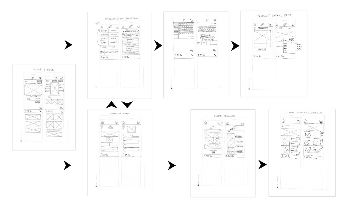
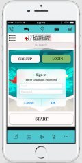
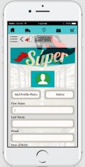
Wireframes

Usability Testing
Link to Prototype: https://www.figma.com/proto/ZvznI61OQwGO4pXsOO7Wj5/GroceryApp?node-id=5%3A124&scaling=contain
Tasks
How would you create an account?
How would you add a grocery item to the shopping cart?
How would you find a recipe and add a recipe item to your cart?
Questions for Participants
Did you find the app easy to use?
What parts were most enjoyable to use?
Did you find the app frustrating to use in any areas? If so, why?
Do you have any other feedback?
Usability Test Analysis
What went well?
- The Navigation was simple to use.
- The Meal Planner section was enjoyable to find
- Sizing choice on the one page was appreciated
What needs to change?
- The naming of the ‘Select Sizing’ in product section needs to change to ‘Choose’ to be more familiar.
- Change layout of Signup page
- Meal Planner could potentially be changed to ‘Recipes’
- Better explanation on the substitution ‘opt in’ with maybe a ‘more…’ section with a better and more detailed description.
Learnings
Overall i think the app was a success in the design. Users found it easy to navigate through in general and found the features useful.
There is still a little work to be done in refining the extra needed elements such as ‘opt in’ extended description and also the change of button label for the ‘Select Sizing’ on the product page. Possibly also change the ‘Meal Planner’ to ‘Recipes’.
The next steps for the grocery app should be to add a fully functional product cart, product selections and Delivery setup.
The app should also have a choice before adding items to cart of choosing either, ‘Delivery’ or ‘Pick up’. This could then navigate to Delivery times/options for the Delivery option and Pick up date/time for the Pick up option.
The Grocery app has all that it needs to gain user insights in the current pain points as gathered from the initial user reseach as it is and the next steps would be a fully functional prototype with all screens included.
This i suggest, would also need to be user tested again once it was completed/refined before sending the design to the Developer team to begin product development.
Other Case Studies
Shirts By Mike
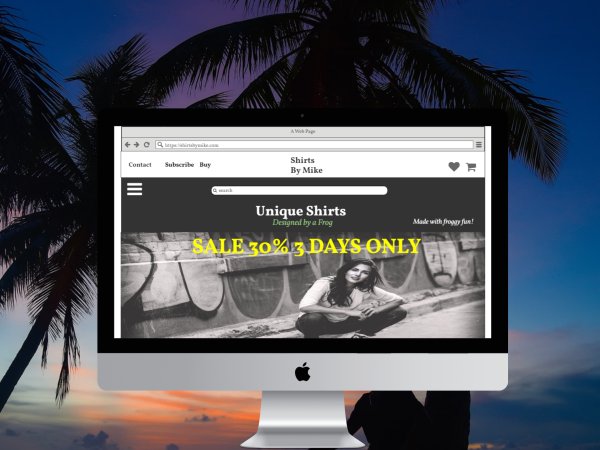
Case Study
T-shirt website; 'Shirts by Mike'. Company objectives included giving the website a fresh new design, Increase sales and launch a featured t-shirt of the month.
Read MoreWhooshMail
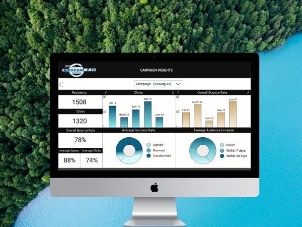
Case Study
Created for WhooshMail, An email Marketing Campaign. Company goals involved Increasing first month retention and campaigns sent by 20% ..
Read More